
Driving Engagement Through Smarter Navigation and Messaging
Summary
I led a major refresh of Huddled’s navigation and messaging based on user research that revealed friction in finding chats and contacting teammates. Through rapid prototyping and testing, we simplified navigation, added a user-driven search function, and modernised messaging with a chat bubble design, setting the stage for Huddled 2.0.
Project length: 1 month
Team: 1 product manager, 1 designer (me), 3 engineers
Revealing motivations, pain points and habits
By reviewing user session recordings (12 students, 4 mentors, 2 admins, and 2 buyers), we uncovered user habits showing difficulty performing key actions Huddled aims for, like connecting with others, leading to a lack of connection and engagement.
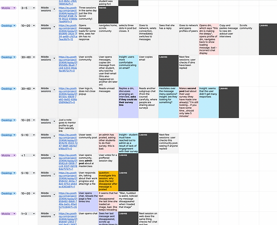
Recording User Journeys
%20(1).png)
Students focused on class feed and mentor questions, faced communication friction, and rarely posted publicly
Most students started by checking the community feed and messages. While many were passive, students in upskilling courses were more likely to explore others’ profiles.
The "Connection Chain Reaction"
An intersting observation was that social actions often triggered more activity - seeing others post introductions, complete profiles, or get connection requests made students more likely to do the same. This reveals a need to lower social barriers and prompt early engagement within huddled.
%20(5).png)
Student Insights
Educators spent a majority of their time replying to students' messages, occasionally posting in communities.
Most of this activity took place on the messages page, through direct messages and subgroup chats. Interviews revealed that chat bugs caused friction and the feature felt underdeveloped. Tasks like posting the same announcements across different communities or replying to similar comments became repetitive and tedious.
User goals
%20(7).png)
Admins were involved across the board and faced friction in managing communities.
Educator Insights
Surprisingly, admins actively communicated with both students and mentors, and their messages section was often crowded with direct messages from multiple subgroups. It appeared they spent a lot of time scrolling and navigating between communities just to complete routine tasks.
%20(6).png)
Admin Insights
Through interviews, we learnt that users had trouble completing key objectives within the app.
I had trouble finding student engagement pages and important info, unlike Slack where I could easily browse channels — Student User
Initially I wasn’t sure where to find the courses I was handling— Educator
This had a clear impact on class engagement, with some students reporting that it felt lower compared to other platforms their institution had previously used.
These insights highlighted the need for better message organisation, sparking a layout update that prioritises communication.
Uncovering trends from competitor product audits
- Why [x] over Huddled?
We analysed competitor platforms, particularly those our clients and users had churned to, to identify patterns and gaps in our own product.
Key Patterns
1. Sidebar Channel Navigation
Provides a clear and efficient way to switch between conversations, making multitasking easier and reducing confusion.
2. Visible & Discoverable Core Actions
Prominently placing key actions like search, new chat, or group info empowers users to take action confidently without hunting through menus.
3. Message Organisation Features
Threads, pins, and reactions help structure conversations and highlight key info, making chats easier to follow.
These features make communication feel seamless and natural, encouraging users to stay connected and engaged.
%20(8).png)
Cutting Taps, Improving Usability
The original navigation was layered like an onion, requiring users to peel back multiple levels to reach class chats. The proposed design aimed to cut out the extra steps.
Existing layout - 3 taps
Homepage
Community
Subgroups
Subgroup chat
Proposed layout (Lo-fi) - 1 taps
.png)
.png)
Homepage
Subgroup chat
Designing at Speed with Real Users
Since this project involved a fundamental change to the app’s structure and required significant development effort, we conducted thorough yet rapid prototyping, iteration and user testing with users across all roles (students, mentors, and admins) to ensure the new layout meets their needs.
Figma prototyping
User Testing Record
.png)

Key Iterations & Experiments


Nav change MVP


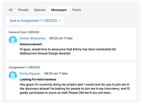
Search Function: Helping users find spaces, people and content
User research showed that users struggled to find teammates and key information. Based on this feedback, we prioritised adding search as part of the navigation update to reduce friction and help users quickly locate what they need. We analysed Google Chat, Slack, and Discord to design a basic and intuitive search experience.

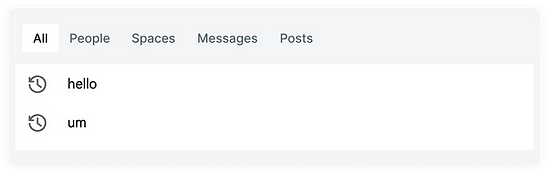
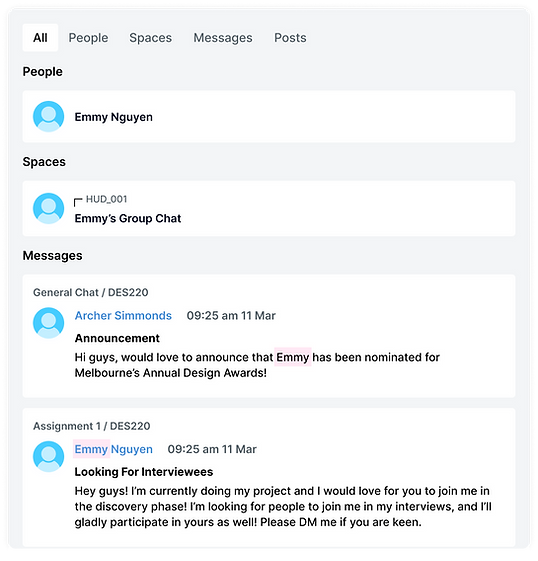
Empty State
Default Tab
Auto filter when pressing search icon in a chat
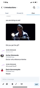
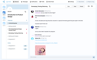
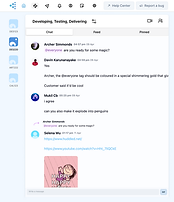
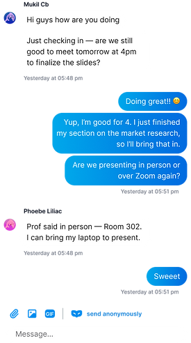
Making messaging feel fun and modern
From user feedback, we learned that messaging felt “underdeveloped” due to bugs and its overall look and feel. It didn’t match the quality or familiarity of platforms users were accustomed to. After research and discussion with the team, we chose a bubble-style chat format to bring more personality to the experience. This was part of the company’s broader initiative to shape Huddled 2.0.

Final Layout


.png)
Results
This major refresh of Huddled’s navigation and messaging successfully drove significant improvements in user engagement and prepared the platform for Huddled 2.0. These changes led to a platform which resonated more with students and mentors, and a clear increase in communication efficiency and user satisfaction.
Reflection
As the sole designer leading this project, I honed my ability to rapidly prototype, iterate, and user-test fundamental structural changes while prioritising features with the highest impact on core user goals. This experience showed the critical balance between speed of execution and thorough user validation in a dynamic startup environment. If I could go back, I would embed more quantitative instrumentation earlier, so we could track behavioural change and adoption metrics more precisely post-launch.