

Discovery at Huddled
Summary
Huddled is a student communication platform for education providers.
As their founding product designer, I stepped into a blank slate. In my first month, I led our first wave of user discovery, connecting directly with students, mentors, and admins to uncover core engagement and communication issues. By surfacing previously unseen gaps, we shaped the roadmap and helped shift the company toward a more insight-driven design process.
Understanding the landscape
Where is huddled's place in this landscape of communication apps? In my first few days, I set out to understand it's place in the market, and how they operate.


Huddled's vision: become the preferred communication platform for education providers.
I learned that our main competitors are Slack, and Microsoft Teams — widely used, but not built for education. With many communication platforms out there, Huddled aims to carve out its own space by creating implicit value through faster school onboarding, stronger LMS integration, and a classroom-focused experience.
Keen for an interview?
One crucial thing was clear: the lack of user research, particularly with end users (students and mentors). I quickly identified the next step: reaching out to them via email to start conversations and build connections. By A/B testing subject lines in MailerLite and keeping the tone casual, we boosted engagement. Meanwhile, the CEO connected me with admins, who also helped us reach out to mentors.

Mass email outreach to users
Interviews: How can we make your life better?
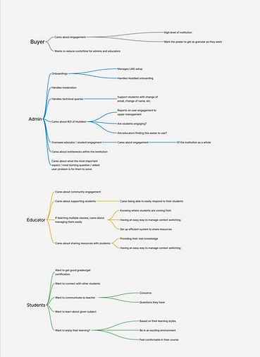
Over the next two weeks, I led one-on-one interviews with 17 participants across 4 user types to understand how Huddled could enhance their education experience in ways other platforms haven't. Given our pre-product market fit stage, we conducted semi-structured interviews focusing on key areas: users’ primary goals, their experience with Huddled, how they engage with the platform, and the challenges they face.
1
User Interviews - Two weeks wrapped

.png)
User Personas
Education providers offered a mix of online and hybrid bootcamp-style courses focused on career-specific skills, often structured around projects and assignments.
Admins cared about overseeing student and mentor activity, and had a relatively "good" view of the automated onboarding process as it sped up their process significantly.
The Student demographic includes career changers and upskilling university students, ranging from their 20s to 50s. They're typically self-motivated, and keen to connect with others. Mentors care about supporting student learning.
Mentors and students voiced their dissatisfaction, revealing unmet needs around communication, connection, and engagement—areas that became a central focus during discovery.

User goals
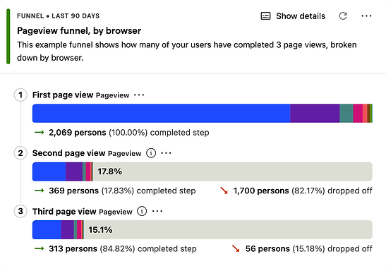
Retention issues revealed through data analytics
1. 5.4% of users stay after the first week
This is a glaring sign that a majority of users are losing interest or not finding enough value in the product, possibly starting with the onboarding process. It highlights the need for improvements in user engagement, retention strategies, and product value.
2. 17.8% of users make it past the first page
This suggests friction or other factors that are preventing people from exploring further. Our performance analytics reveal that slow loading speeds may be contributing to this poor first impression.

PostHog data


Understanding users' journeys
Watching session recordings and tracking user behavior across key sessions revealed patterns often missed in interviews.
We found that for many students, their workflow was just checking announcements and messages, with only a rare few students connecting and messsaging others. Mentors mainly use the platform to post updates and respond to student queries. We also identified several friction points which revealed usability and navigation issues.

User Journey Tracking
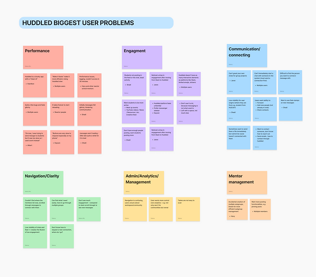
The main problems with Huddled
After compiling a list of insights and problems from both interviews and session recordings, we identified the key issues to address and categorized them accordingly.
1. Performance and Bugs
Performance issues emerged as a top priority. Many interviewees reported that the app feels slow, creating a ripple effect that impacts all other areas of the experience.
2. Communication and Connecting
We found that Huddled lacks key communication fundamentals, and it was not fulfilling user needs. For example, users can't message someone without first "connecting," and there’s no way to create custom group chats.
3. Navigation and Clarity
Users often struggled to find resources, with many saying things like, "I didn’t know where to...," highlighting issues with navigation and overall clarity.
4. Engagement
Students and mentors reported a drop in engagement since moving from Slack, affecting the classroom environment. Engagement is also closely tied to the other issues above, as they all contribute to users feeling less connected and active on the platform.

Huddled vs Competitor functionality
We set out to understand what functionalities competitor communication apps offer, looking at the layouts, chat features, and workflows users are familiar with and expect.
We found that other apps have sidebar navigation, easier ways to message others, and a range of small but collectively important features, like pinning messages, message threads, emoji reactions, message forwarding, @everyone mentions, and more.

Huddled vs Competitor features
Juggling priorities in the startup space
One important part of this experience was understanding the mindset and priorities of the company, which heavily influenced our decisions. At a startup, where things change rapidly, we had important discussions to help shape the roadmap ahead.
%20(2600%20x%201080%20px.png)
Communicating design insights
Presenting these design insights and research to the team played a key role in shaping the roadmap, influencing both short-term improvements and long-term strategic changes, such as the navigation overhaul.


Discovery Insights Presentation
Designs
Quick-win designs
Throughout the month, we released several low-engineering-effort but moderate-impact features to deliver immediate value to users. These features received positive feedback and helped reduce friction in connecting and posting.
Added pinned post feature
Shipped quick-win features


Added edit post feature
.png)
Old

New

Added time stamps
Added mutual/associated communities
Gives users context about their connections
Create group chat
Encourages users to establish their own channels, giving them more autonomy
.png)
Added edit message feature

Added message feature (before connecting)
Reduces communication barriers between users

Added notification red dot
Show users where there are new updates, increases the visibility of engagement

Navigation redesign (a long work in progress)
In the meantime, we also focused on a long-term goal of: a navigation overhaul. The aim was to restructure the app to better support communication, bringing key channels to the forefront to drive engagement. This redesign is currently going through iterations and user testing.
Navigation redesign Figma board
Huddled's existing component library

Utilising both existing and new design systems
When I first joined, Huddled didn’t have an existing design component library. I built one to support quick-win designs and faster iterations. In parallel, I’m developing a new design system by collaborating with marketing to align with brand guidelines and working with developers to understand their current component libraries. This initiative aims to ensure future designs are more consistent, accessible, and user-friendly.
Existing Component Library

New Component Library

Summary
As a result of this foundational discovery and design work, Huddled gained crucial user insights that shifted the company towards a more insight-driven design process. The quick-win features implemented, received positive feedback from students and mentors, reducing immediate communication friction. While direct, measurable impact on key retention metrics is a long-term goal for the ongoing navigation overhaul, these initial improvements laid the groundwork for a more engaging platform.
Reflection
As the founding product designer, this experience highlighted both the challenges and immense rewards of building from a blank slate, from juggling priorities in a fast-paced startup to balancing immediate value delivery with strategic, long-term overhauls like the navigation redesign. Looking back, what I could have done better was to implement a more robust framework for measuring the importance of the app's key problems to provide clearer data points for future prioritisation.