
App
Hubio
Personal Project
Summary
Hubio is a communication app that aims to create a central hub where teams can message, share files, and manage tasks efficiently. It features an interconnected system and is designed for small to medium sized work teams.
Access important tabs within one screen
A "hub" is created for each Chat in Hubio, with tabs of key work tasks - messaging, calling, file sharing and tasks. Users can switch between tabs as they work. This layout enables multitasking and better visibility. Updates, such as newly assigned tasks, will appear on a minimized bar for improved transparency.
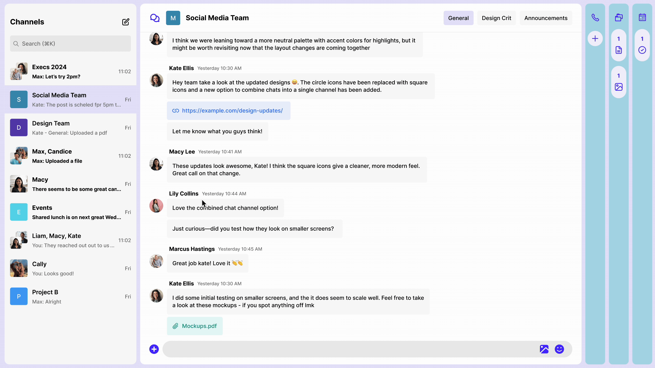
Streamlining navigation with a linked system
A significant part of our workflow is spending time finding or navigating to resources. However, with hubio, I designed linked chat items for files, tasks, huddles, taking team members straight to the source without the hassle of searching.
Hubio further saves time with automatic chat messages for actions like task creation and file uploads. For instance, a message can be triggered as soon as a file is uploaded, minimising waiting time while staying in the same tab.


.png)
.png)
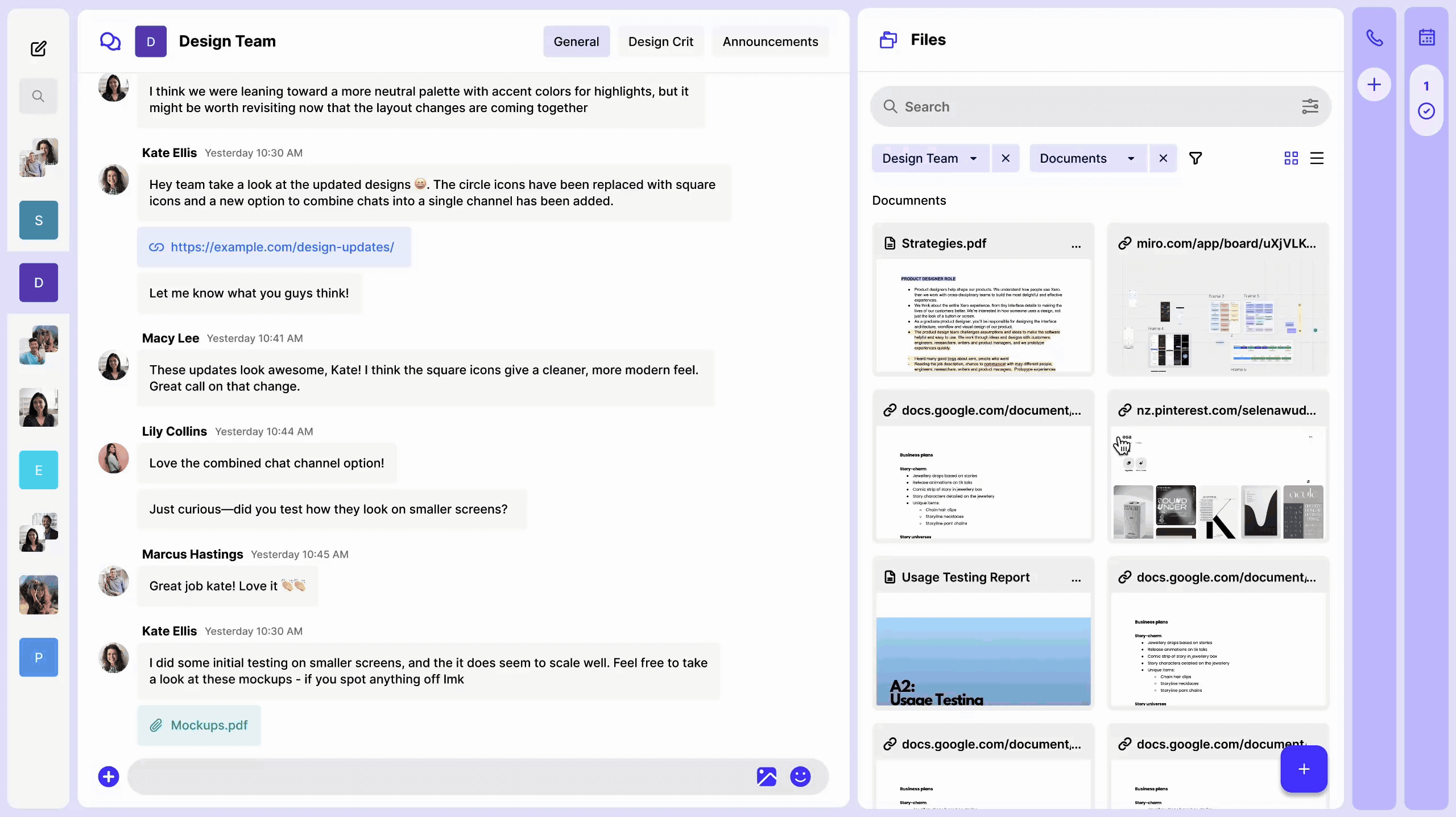
Documents where they need to be
Users can filter documents by type, last modified, and location status (sorted or unsorted). Unsorted files are those shared in chats/huddles but not yet added to the system. By default, documents are linked to the folder associated with their chat, centralising information.

Design Process
Where did this all begin?
As the leader of a university club, I struggled with scattered systems - messenger for chats, Google Drive for files, and a separate platform for tasks. Members often couldn’t find files or stay updated on tasks, leading to confusion and frustration. This inspired me to create an app that centralises everything, instantly showing group updates upon opening the app, ensuring everyone stays informed without constant reminders.
3 key focuses: Automation, clarity & connectivity.
Finding pain points in work communication apps
I started with brief surveys among peers, exploring two areas: identifying general communication pain points/needs and evaluating the pros and cons of familiar apps. These insights guided my design approach, with a primary focus on building a unified workplace that promotes transparency in task updates.
.jpg)
Pain points
App pros & cons
Through my competitive analysis and feedback from peers, I learnt that messenger, despite having limited work integrations was a popular app for messaging due to its clear format, while Slack and Discord are better for workspace management. My app aims to combine these strengths.
.jpg)
Precedent analysis
Identifying work tasks
I conducted a group brainstorm session to discover essential work tasks to revolve the app around. We ideated within the space of communication/ information sharing.
.jpg)
Categorising key tasks
Centralising workspaces using "Hubs"
The name "Hubio" embodies the idea of a hub chat that integrates files, tasks, and calls in one centralized space. The displayed files and tasks adjust (dynamically filter) to the selected hub, while information from other hubs remains accessible.
I also focused on the concept of interconnectivity, where items can be easily shared to the chat as links to the source.

Layout ideation
A clean layout with no hidden pockets
After wireframing several layout options, I chose a column tabular design that allows users to expand, minimise, and rearrange tabs based on their preferences.
To guide my design decisions, I tested both minimised and expanded formats. For example, in the chat feature, I positioned the all message bubbles to be on one side of the screen, ensuring reading coherence when minimised.
.png)
Layout wireframing
.jpg)
Minimised vs expanded screens
A professional and user friendly interface
In my component design, I chose a combination of squared and rounded layouts. Most components feature a rounded square design, while I use softer icons for and bubbles for the chat to provide a visually distinct and readable experience.
.png)
Component library